objective
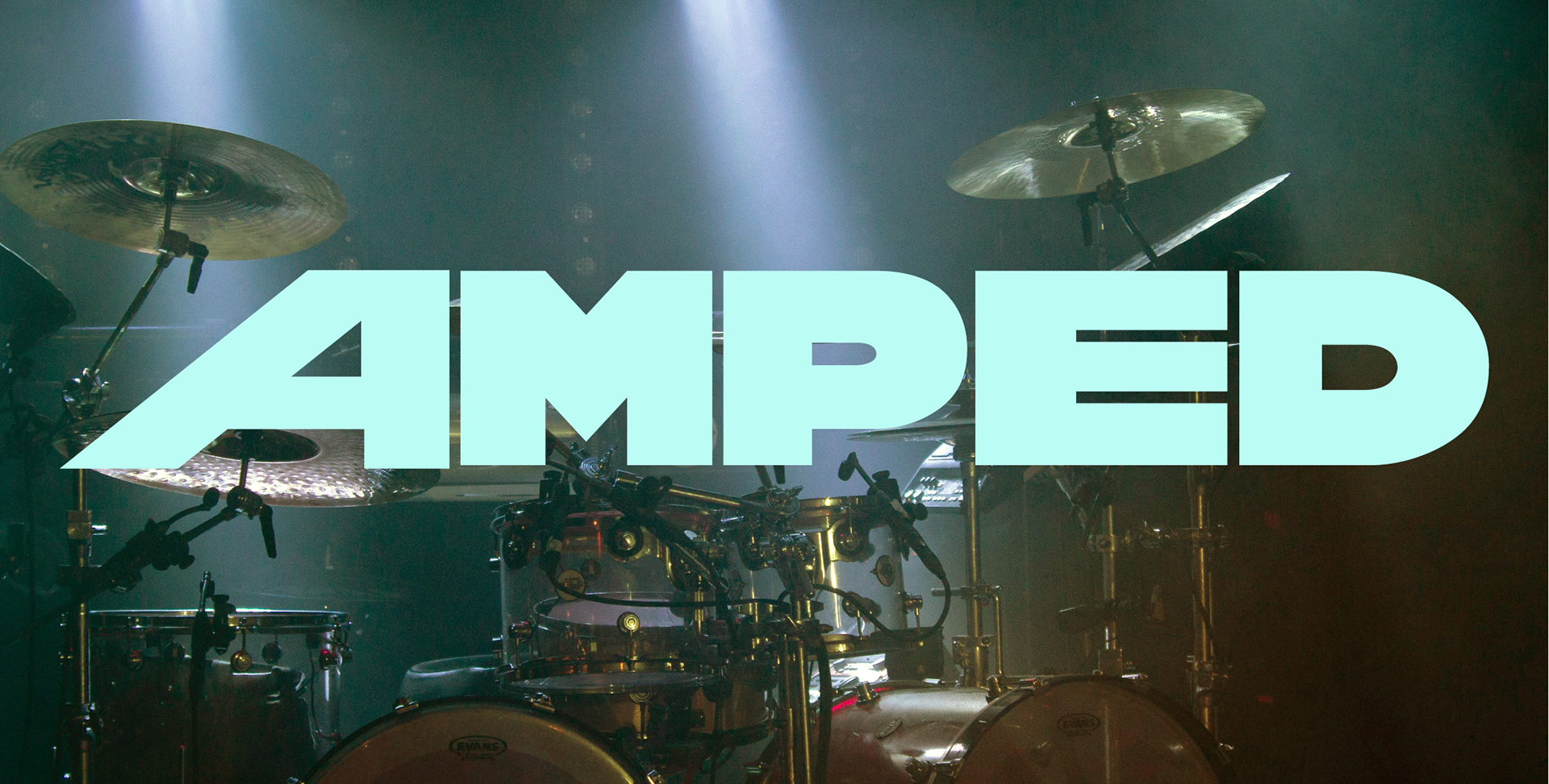
This project involved creating a wordmark for a hypothetical magazine that conveys meaning and establishes a visual language. For my magazine, I created AMPED, a publication that embraces the vulnerable and authentic side of making music and promotes musicians who resist the temptation to conform to trends. I wanted my wordmark to be loud, bold, and personify nonconformity and individualism.
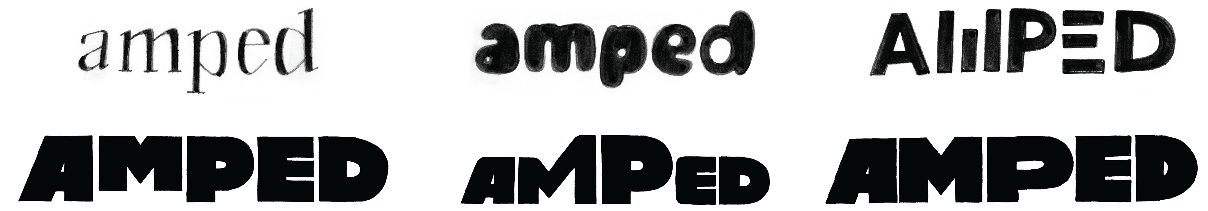
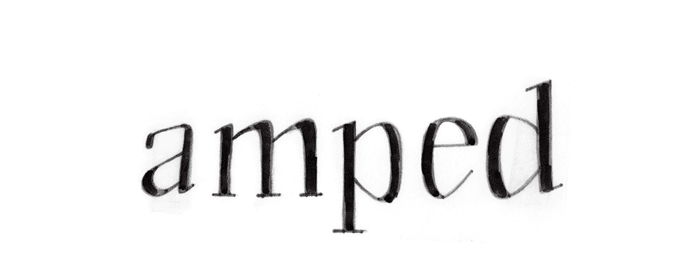
initial sketches
To begin, I gathered a wide range of typefaces that could be used for my wordmark. Then, using printouts of those typefaces, tracing paper, and sharpie markers, I created many analog sketches that explored various directions.
digital iterations
After choosing a direction, I began iterating digitally using the pen tool in Adobe Illustrator.

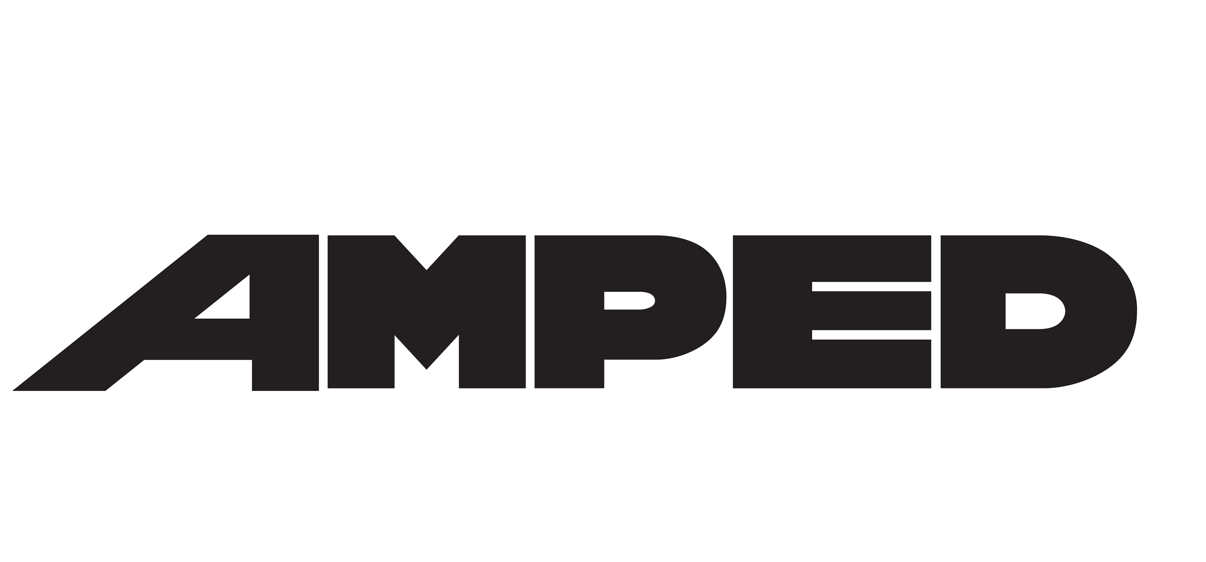
final wordmark
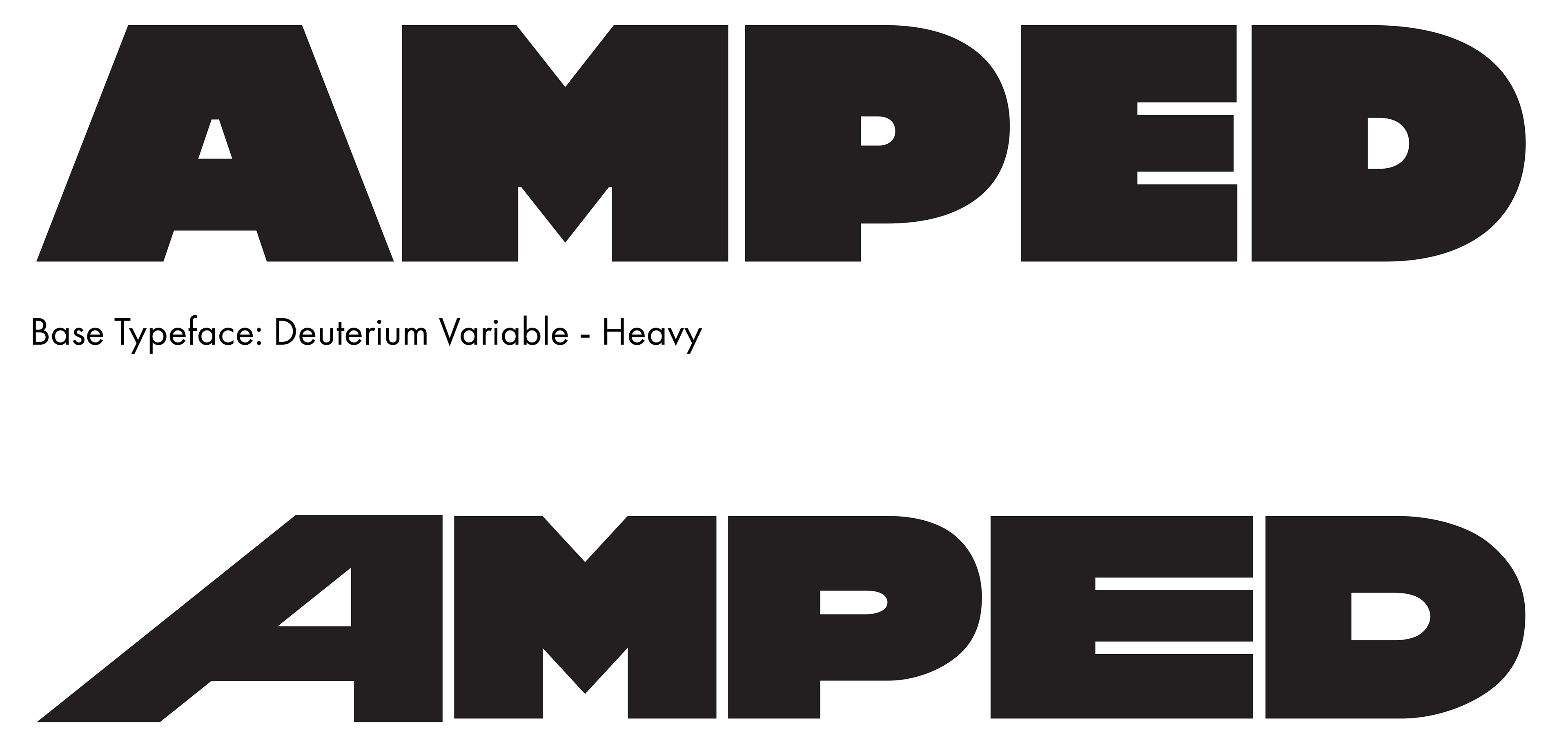
For the final design, I altered the width of all the letterforms to be equal except the “A”, creating an anomaly. The “A” is meant to personify artists who are true to themselves and their music, even if it opposes the mainstream. To further emphasize my message, I chose a typeface with a heavy weight to communicate loudness and boldness.